ALBUM DESIGN
The first design job I ever had was as a freelancer at TVT Records. It was nothing to write home about at first, but within two years I had become the Art Director there, and by the time it folded, I had designed roughly seventy-five albums, including several multi-platinum.
There is no better way to learn than to be thrown into the deep end.
My skillset came as much from a love and understanding of music as it did from a facility with fonts and histograms and color profiles. I wasn’t at TVT long before I was designing albums, and there is no better way to learn than to be thrown into the deep end.
![]()

The design project I’m proudest of. No question.
I had been working at TVT Records for only a few months when one of the A&R guys walked into the art department and asked me if I wanted to design the new Guided By Voices album. Who happened to be my favorite band in the world at the time.
I wound up designing everything for the band’s next two releases. The pinnacle is this album, with its fold-out wing flaps.

When I came up with the idea to hide the lyrics like this, in the flaps of the digipak, we had to convince the manufacturing plant because they had never done anything like this before. They had always glued them down. We won.
![]()

This seven inch sleeve featured die-cut eye holes (the first of many projects involving die cuts, spot varnishes, transparent stickers, etc.) that showed through to eyes that changed as the wheel was spun. Bird eyes, disco balls, my own watch, beer cans (of course, given the band).
The best record cover since the Rolling Stones’ Some Girls. –Time Out New York
I didn’t have any experience with elaborate production before, and I think this project more than any other got me over my fear of the process. It’s not a great mystery – the parts go together the way they go together, and if you design it properly, it will come out properly, it’s as simple as that.
![]()

Was it a thrill to work on a Snoop Dogg project? It was cool. It was very cool.
The label had snapped up this project when another label backed out for legal reasons, and everything was already set into motion, and it was a tight deadline. This was what TVT did well. A big expensive photo shoot was dropped in my lap and I was tasked with turning it into an album package.
It looked like someone had had Reservoir Dogs in mind when imagining the album, and that’s where we ended up.
![]()

I absolutely loved this band. They were great guys, and their live show was an explosion of energy. I tried to capture the energy for the cover.
A few months after the album came out, their A&R Rep brought me a clipping from a little magazine: an album review of The Art of Rolling. I wish I had kept it. It read something like: I had never heard of this band, but the cover caught my eye, and I had to buy it to hear whether the music could live up to the energy of the cover. And it did.
![]()
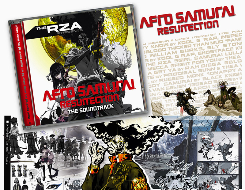
Sadly, I didn’t get to meet the man while working on this project.
This was another of those projects in which a bounty of amazing art is given to you, and your main restriction is the production budget. I only got a six panel folder to work with, and could have filled a 32-page booklet.
![]()

The concept had been decided upon long before I even knew about this project: a car painted down the middle to represent the yin (ahem) and yang of the group. One half black, one half white. As musician-developed album design concepts go, this one was actually surprisingly great.
When I arrived at the photo shoot, there was indeed a two-toned car, and it was very cool. But it was a shell. It was only the frame, so I knew I’d be pulling in every Photoshop trick I had ever known to make that car a car.
The photographer, Michael Blackwell, was someone I had worked with many times before, and the two of us practically had our own language at this point. We exchanged a look when we saw the car, but we both realized the two of us could pull it off.