SALON.COM
For the first year or two of my tenure at Salon, the vast majority of my job entailed coming up with featured images for the stories on the site, which meant figuring out new angles for similar story topics. One of the great creative challenges – and joys – is to come up with a wholly original concept for a well-trodden subject.
Squint. If it doesn’t read when your vision is blurry, get back to work.
The featured image on Salon is just small enough to keep a designer focused in the right direction: something that reads instantly, even as a thumbnail on a phone screen. The old trick works – squint. If it doesn’t read when your vision is blurry, get back to work.
A promotion to Senior Art Director brought with it a wide range of exciting new design responsibilities, including branding and advertising work, motion graphic design to support the newly assembled video department, and perhaps most exciting of all:
![]()
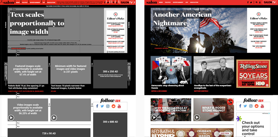
It had been years since Salon had implemented a full redesign, and there remained a distant institutional memory of the disastrous redesign just before I first started working there. A new look had been rolled out that relied heavily on knockout white-on-black text, sending countless loyal Salon readers to the comment section of seemingly every article to register their horror. So, this time around, we were sure to use knockout text sparingly.
The budget was finally set, the (very tight) deadlines drawn up, and an outside firm was brought in to implement my front-end designs. It is the most extensive single project I’ve ever been a part of, and the painstaking work paid off in a much more refined, intuitive and efficient site.

![]()
The design of the app followed fairly closely to the redesign. One challenge was differentiating the video content from written content, which we did with a bold, text-forward image treatment.

![]()
Like many media sites, Salon added a video department a few years back, and it was a great opportunity for me to sharpen my animation skills. My favorite projects were title treatments – a chance to treat some of the assets I’d already been working with for some time in a new, dynamic way.

![]()
The featured images for the stories on a media site have to do a lot of things in order to work, and you don’t get a lot of time to conceptualize, source your images, and execute.
First and foremost, they have to tell a story. A simple little story. Without that little something that lights up the story-ravenous human brain, the image is not helping. It may not be hurting, but it’s not helping either, no matter how pretty it looks.


![]()
My first design job was as a freelancer creating simple black-and-white admats, and there’s nothing like tight restrictions to boost skills and creativity.
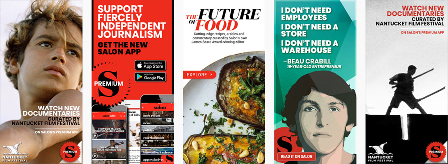
Designing advertising for Salon was far less rigid, but I did tend to stick within a fairly narrow vocabulary, typically working with 3 colors and roughly that many fonts.

