3D MODELING
Deciding to learn 3D modeling was a very big, very smart decision. At the time, I was working on an intensive freelance job alongside a 3D modeler. Watching his screen, I knew my brain would be good at it.
For me, 3D modeling is an impressive 1-2-3 punch
Once I got up and running on it, and with the safety net of having Photoshop expertise waiting at the other end of the render queue, I was able to create a whole new kind of graphic.
For me, 3D modeling is an impressive 1-2-3 punch – carefully drawn paths from Illustrator can be extruded into shapes, textured and lit and flown after rendering into Photoshop. And that’s just the most straightforward workflow. There is no end to the ways 3D modeling can be used.
![]()

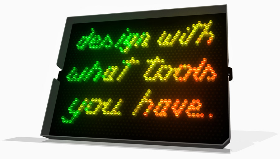
I could never be a font designer – it’s just not in my constitution. That said, I have always loved projects like this, where it is necessary to create text within some kind of pattern or scheme.
This design was based precisely on an actual Lite-Brite that my wife has owned since she was a kid. We used it for years as a New York City fireplace (that design project – creating flame out of whatever color pegs she still had – was another challenge altogether), and one day I looked at it and decided to make something fun and inspirational.
![]()

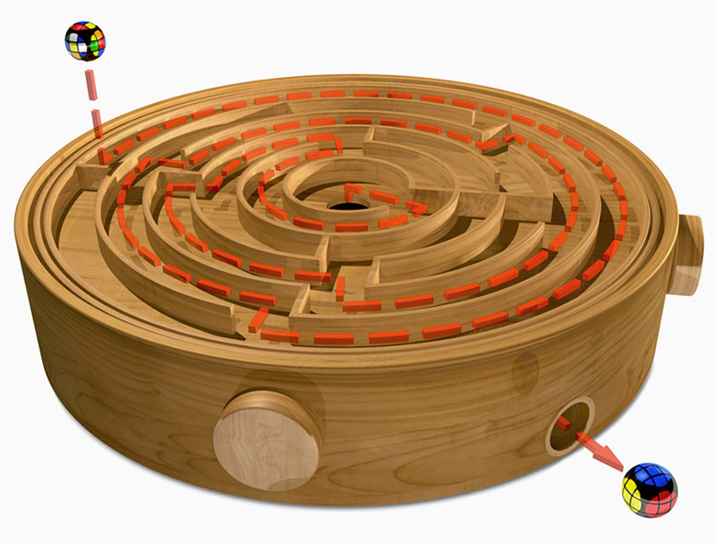
Another personal project I undertook to strengthen my modeling and texturing skills.
The spherical Rubik’s Cube never really got its due. Sure it was a knockoff, and nobody every really loves knockoffs, but the design was ingenious and whoever was in charge gets a thanks from me.
![]()

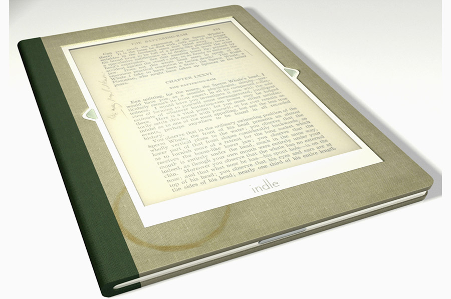
This was the first 3D modeling job I ever got, and I’m frankly amazed that it came out as good as it did. The likelier scenario would have been to wind up with something I can’t bear to look at now, but this completely holds up.
It was also my first stint working on a Vanity Fair project, and as was always the case, they were incredible people to work with. They had come up with this quirky, funny concept for an e-reader for the Used Book Store set, complete with old fabric binding (pre-stained with a ring of coffee) and marginalia.
My father gets an assist on this, because I scanned some of the notes he had scribbled in the margins of his old copy of Moby Dick. They pull everything together.
![]()

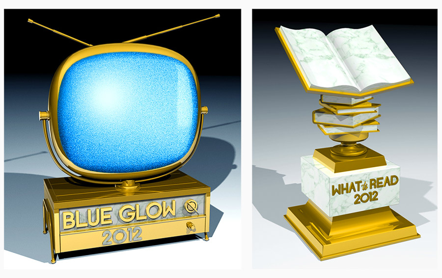
These awards had been something of a fixture at Salon for years, but I was asked to create a new look for the project, and decided on trophies. Everybody loves trophies, probably because none of us ever won enough as kids.
These trophies had to evoke a retro feel, and another thing everyone seems to love is antique televisions. You know, the kind from back when it was furniture.
The What To Read trophy was a bigger challenge, though, when all was said and done. Figuring out how to make a trophy based on books took me a lot of trial and error, but the addition of the marble for the pages pulled everything together nicely.
