INFOGRAPHICS
To me, the main purpose of an infographic is not to guide you step by step through a story, skipping from motif to motif. Rather, it is about getting across a simple concept in an unexpected way. Teaching you about a correlation by hitting you in the eyeballs with it.
Teaching you about a correlation by hitting you in the eyeballs with it.
A favorite challenge of mine is taking codified information and presenting it in a visually interesting way – a way that accentuates the kernel of meaning that drew me into the story in the first place. It can be as complex as state-by-state election data or as simple as the arrangement of chairs in a room.
![]()
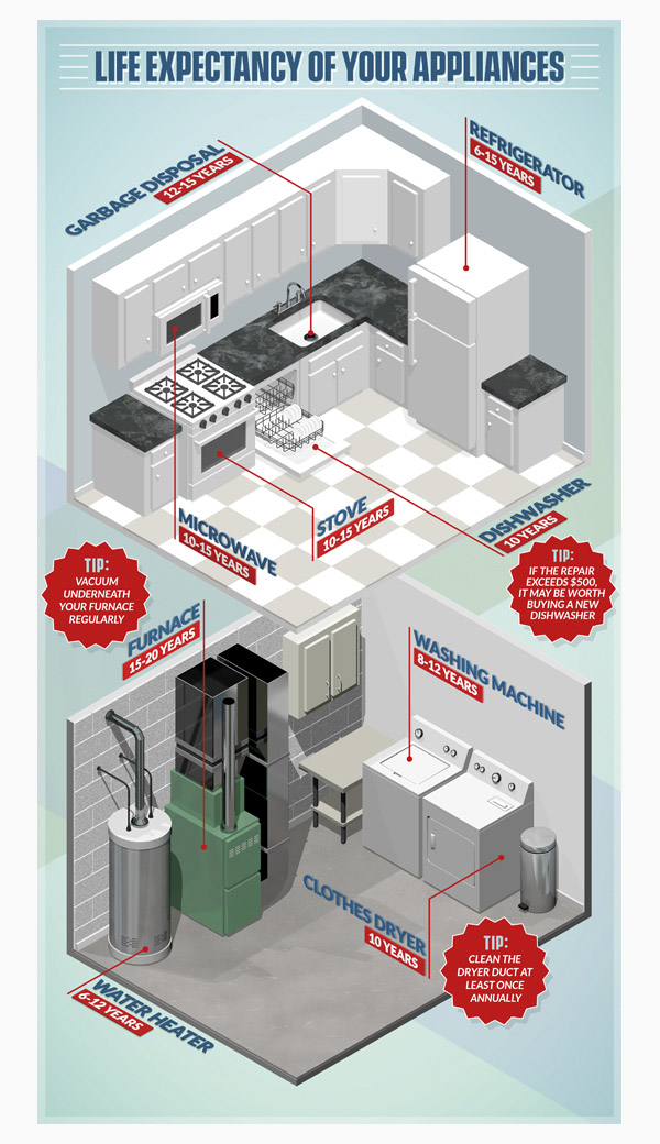
Isometric graphics are perfect for text-based infographics, because the size of objects does not change depending on how far they are from the “camera.” The client was wary of trying to do the appliance label text in 3D, but I asked them to let me give it a go. I shared all their same concerns and standards when it comes to readability and cleanliness.
The isometric view allowed me to keep all the text consistent and gave the whole image a fun, stylized feel. Had I tried to pull this off in true perspective, it would never have worked.
![]()
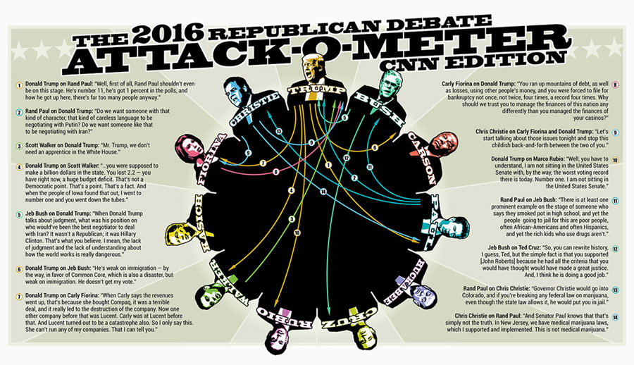
Creating an infographic for politics is both incredibly fun and almost prohibitively difficult, due to the lightning speed of the news cycle. Coming up with an original idea that lays out meaningful data is hard enough – now try executing it in time for readers to still care about the topic.
For this one, I laid out the entire thing days in advance of the debate in question. I knew I wanted to illustrate the various attacks from candidate to candidate, but I had no way of knowing who would be ambushing whom.
So, I created a version that showed every single candidate attacking every other candidate – 121 little arrows in all. Then I watched the debate hoping for fireworks, knowing I’d be up until 3:00 AM finishing it to feed to the ravenous political junkies out there.
![]()
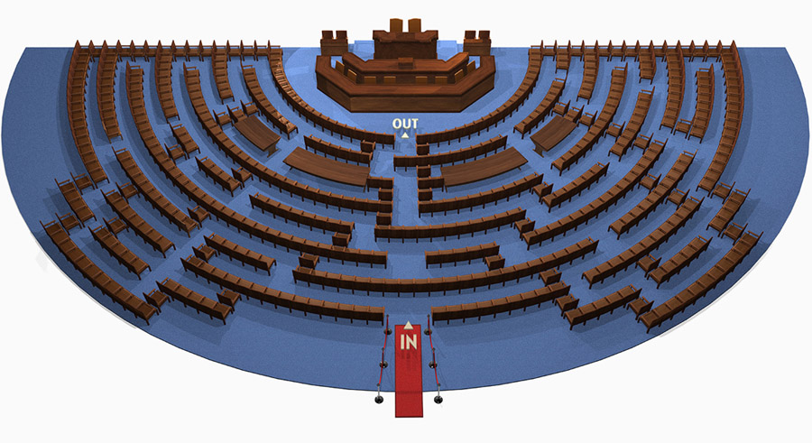
I pitched this idea to the good people at Vanity Fair and they loved it. The image speaks for itself, if you’ve been following politics in the slightest lately.
Working from photos of the actual interior of Congress, I modeled cushy chairs, curved desks, and wood paneling, then rearranged everything to create a maze. To get a bill through congress, you have to navigate the maze – that’s the idea.
Vanity Fair got some of their in-house funny people to flesh out the concept and the rest was history.
![]()
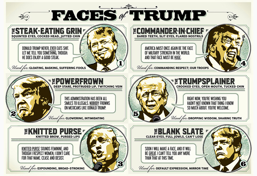
This was a concept I came up with, and executing it was incredibly fun. I didn’t always get to do as much writing as I would have liked to in the creative projects for Salon, but this one was all me.
For a big project like this, I tackle it not unlike the way I tackle cleaning the house – work on something until you get sick of it, then move to something else. Repeat until finished. There was a lot to do, between the writing, the typography, the illustrations, and the final layout.
![]()

I’d always wanted to do a map whose states moved up or down to illustrate some data of some sort, but the idea has some huge built-in challenges.
Mainly, the states all cover each other up, so it’s pretty hard to see with any precision what’s going on in every state. So, I really needed something that showed a nation-wide trend, rather than a lot of variation from state to state.
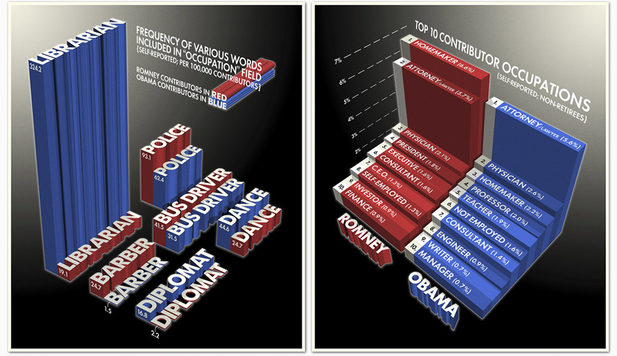
Early during my tenure at Salon, I was put in touch with a writer who had put together a statistical analysis of the newly public political contribution data. We totally geeked out, and came up with some ideas for illustrating what he found.
![]()
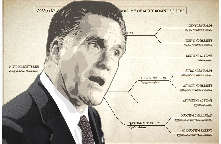
As soon as it became apparent that Mitt Romney’s honesty was going to be something of an issue, I decided to have some fun. My original idea was to write this up under the byline of Charles Darwin, but I quickly scrapped that when it occurred to me that it was a terrible idea.
The hardest part of this for me was the writing. The graphics were a piece of cake, even though the coloration of the Mitt Romney illustration was something I hadn’t come close to doing before, typically opting for more vibrant colors. And the faux-antique diagram was right up my alley.