MOVIE POSTERS
Movie posters are quite large, and it can be something of an adjustment when I switch over from creating much smaller images for the web. There is little strategical difference – create a composition that reads instantly and tells a story. But there sure is a difference when you think about someone leaning in and examining your clipping paths from inches away.
There’s always some image juggling that has to happen.
Movie posters are some of my favorite design challenges. Maybe it’s from my print background in music packaging – I was used to being given a bunch of existing images and told to pull a cohesive design out of it.
It can be like that with movie posters as well. You never seem to get the perfect shot that has all the lead actors, so there’s always some image juggling that has to happen. But once the basic look is laid out, I love the work of finding a home for the title, actors, billing block, etc.
![]()

This movie was full of lush interiors and beautiful costumes and people, so it was a joy to work on. As is usually the case, though, there was not the single still that made sense – that told the story of the movie in one static image.
I had to create a composite from three different stills, which is not at all unusual, and though it was a relatively straightforward design challenge, everything is amplified when the final product is a 29″ by 40″ poster.
Once I had the main image, I decided on a big swooping script title treatment, but pushed it out a bit too far for the frame, to convey the claustrophobia of the movie.
![]()
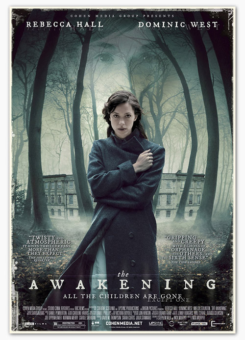
It’s a horror movie, but it’s not that kind of horror movie.
I have always loved movies that live between the genres. There is so much more you can do to create an emotionally resonant poster when the movie itself straddles two worlds. An idea that is creepy in the present is exponentially creepier in eighteenth century rural Britain.
![]()
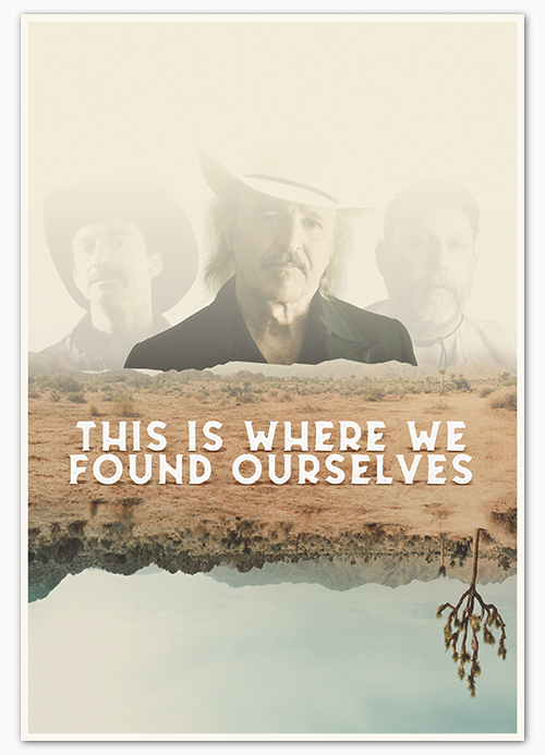
This film was centered around a mysterious collective history involving three characters, and my design had to capture how unreliable and also how fleeting human memory is.
An advantage to working with independent filmmakers is that you can propose screening an actor’s face to 30% opacity and not be told about the demands of that actor’s agent.
![]()
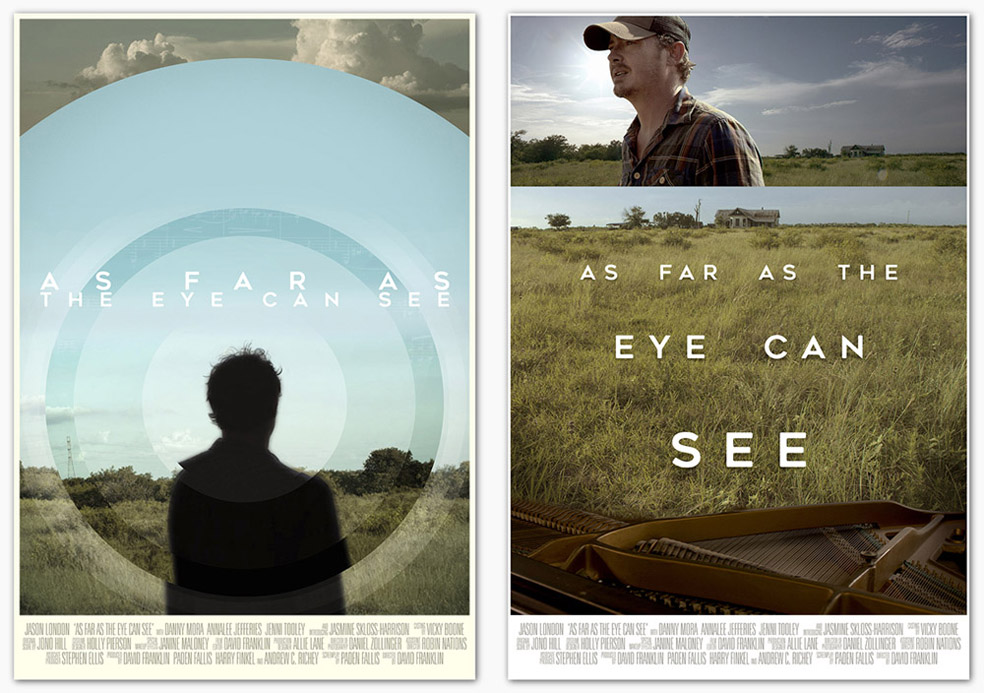
I’m including two designs for this, because this is one of those cases where I like the original design best, better than the one they ended up going with. Any designer out there knows the feeling.
That said, I think they were completely right to go with the second design, because it does fit better with the feel and look of the movie. They thought the first design might feel too sci-fi, instead of the small-town character-driven drama that it is.