IDENTITY
These are the projects for which I created a visual that served as a defining characteristic. Some of these are full campaigns and some are single graphics, but they all share a tightly controlled consideration of what the brand represents and hopes to accomplish.
Create the right mood and tell a story. Tell it fast and tell it big.
Most of the work I have ever created could in some way be slotted into this page. What are album packages if not meticulously crafted branding? Ditto movie posters.
It just goes to show once again that all facets of design, no matter how different, boil down to roughly the same basic concepts: create the right mood and tell a story, Tell it fast and tell it big.
![]()
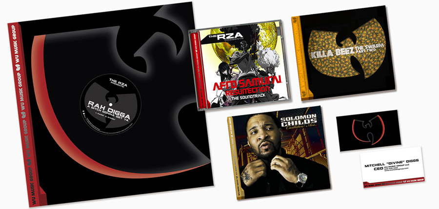
Wu Music Group hired me to design a soundtrack album, and it developed into a great working relationship that found me developing branding for album releases, generic 12-inch sleeves and labels – even their business cards.
The soundtrack album was RZA’s Afro Saumrai: Resurrection, which was one of those projects that had me wishing there were fewer great visual assets to work with. That never happens.
![]()
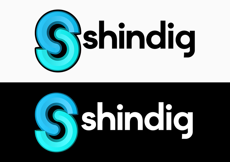
When designing a logo for this video conferencing site, I gravitated toward the concept of linking, creating the S out of two separate rounded shapes that wrap around each other. Based on the familiar “link” icon, I merged the technology of the site’s interface with the more human concept of finding commonalities and embracing them.
This logo was ultimately not chosen, but I still consider it to be one of the strongest designs I have created.
![]()
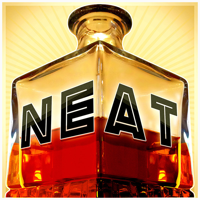
I am a voracious consumer of podcasts, and I think that the visual branding needed to promote a podcast is one of the most exciting design challenges out there.
For this podcast about cocktails, I chose to go for a big low-angle treatment of a crystal decanter with the show’s name placed in perspective to accentuate the scale. Probably the biggest challenge was to adjust the color to truly capture the look of bourbon. People are very particular about their bourbon, as I found when submitting the first few comps.
![]()
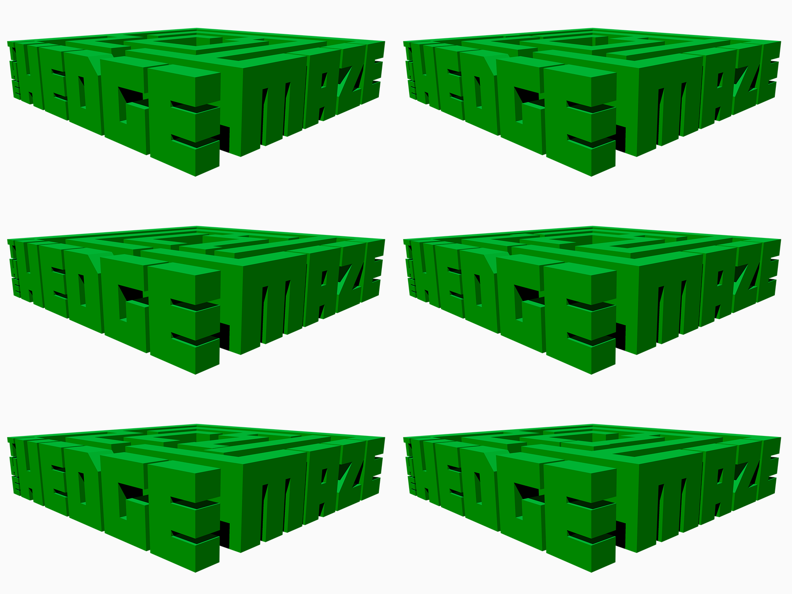
This animated logo treatment was created for a website currently in development that curates “aesthetic content for the elevated mind.” I wanted to get across the idea of entering a special place and losing yourself in an unexpectedly complex world.
![]()
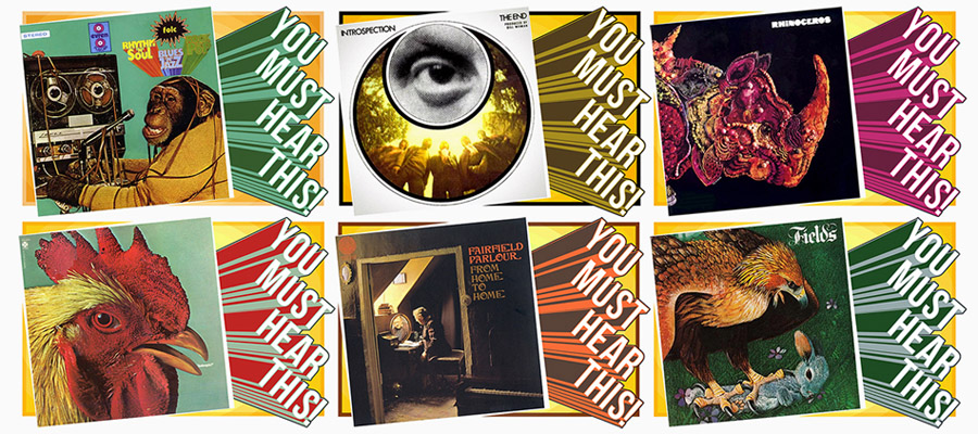
This is a music series I wrote for Salon, in which I would interview musicians from the sixties and seventies about their (brilliant) overlooked songs and albums. It was incredibly fun, and the visuals for the series had to get across that fun, through the prism of late-sixties to early-seventies music packaging.
![]()
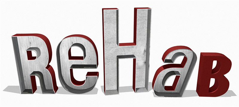
This store in New Orleans had a sign, but no logo. They had cobbled together some old rusted metal sign letters that they had installed over their door, but desperately needed a logo.
I decided that they were further along than they thought – they just needed someone to recreate in Maya what they had already accomplished on their own. It was already the perfect branding for their store, they just hadn’t ever considered using the sign as a logo.
![]()
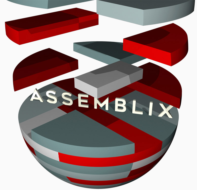
For a project involving interlocking magnetic plastic blocks, what could be better than 3D modeling with Maya? After myriad color combinations, this one was chosen, which I heartily agreed with.
