MY WEDDING INVITATION
Perhaps it’s unprofessional to include your own wedding invitation on your portfolio website, but I really don’t care. This is the design job I have the tightest emotional connection to (obviously). I laid it all out to my own specifications, and wound up printing it at an old printing press in Long Island City.
The project really sharpened my typography skills, but the other major challenge was color. Every piece had to stand out, but the whole package had to work together within our color scheme.
![]()
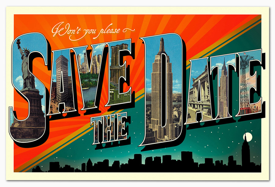
This card was our way of letting people know that we were not messing around. And that it was all going down in New York City.
![]()

The whole invite arrived neatly arranged in this folder, wrapped with a printed belly-band.
![]()
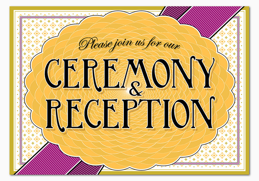
The actual invite itself. I brought back the pattern from the belly-band to serve as the ribbon graphic.
![]()
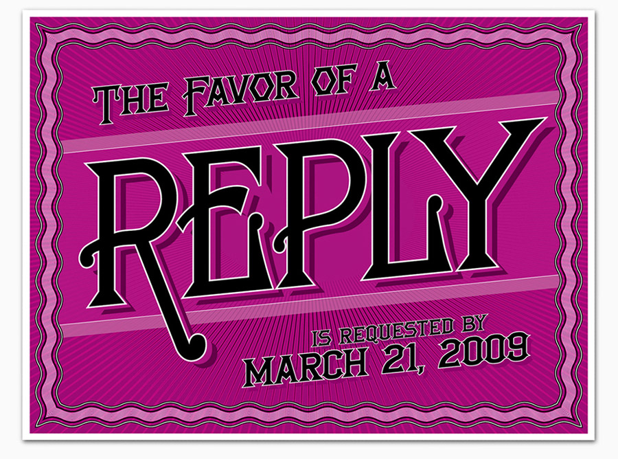
On the back of this card, we had a survey: Who is your favorite Beatle? We were later reminded how silly and clever our friends and family are, by some of their write-in candidates.
![]()
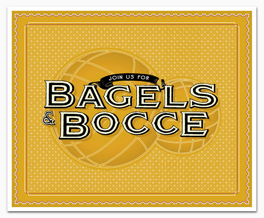
It turns out there are two distinct styles of bocce ball. This one is more traditional, so I used it. To be honest, I think the other kind is a little bit cooler.
![]()
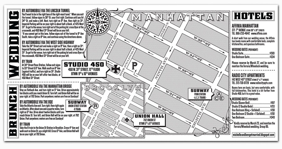
You probably realize by now that things like maps and mazes light up my brain. I have to say that as complicated as this design work was, it was harder to figure out how to give directions through the Lincoln Tunnel to the venue, five blocks away. We honestly should have provided a flow chart.
